Showing posts with label advanced. Show all posts
Showing posts with label advanced. Show all posts
Wednesday, October 10, 2012
Make the web faster with mod_pagespeed, now out of Beta
If your page is on the web, speed matters. For developers and webmasters, making your page faster shouldn’t be a hassle, which is why we introduced mod_pagespeed in 2010. Since then the development team has been working to improve the functionality, quality and performance of this open-source Apache module that automatically optimizes web pages and their resources. Now, after almost two years and eighteen releases, we are announcing that we are taking off the Beta label.
We’re committed to working with the open-source community to continue evolving mod_pagespeed, including more, better and smarter optimizations and support for other web servers. Over 120,000 sites are already using mod_pagespeed to improve the performance of their web pages using the latest techniques and trends in optimization. The product is used worldwide by individual sites, and is also offered by hosting providers, such as DreamHost, Go Daddy and content delivery networks like EdgeCast. With the move out of beta we hope that even more sites will soon benefit from the web performance improvements offered through mod_pagespeed.
mod_pagespeed is a key part of our goal to help make the web faster for everyone. Users prefer faster sites and we have seen that faster pages lead to higher user engagement, conversions, and retention. In fact, page speed is one of the signals in search ranking and ad quality scores. Besides evangelizing for speed, we offer tools and technologies to help measure, quantify, and improve performance, such as Site Speed Reports in Google Analytics, PageSpeed Insights, and PageSpeed Optimization products. In fact, both mod_pagespeed and PageSpeed Service are based on our open-source PageSpeed Optimization Libraries project, and are important ways in which we help websites take advantage of the latest performance best practices.
To learn more about mod_pagespeed and how to incorporate it in your site, watch our recent Google Developers Live session or visit the mod_pagespeed product page.
Wednesday, October 3, 2012
Rich snippets guidelines
Webmaster level: All
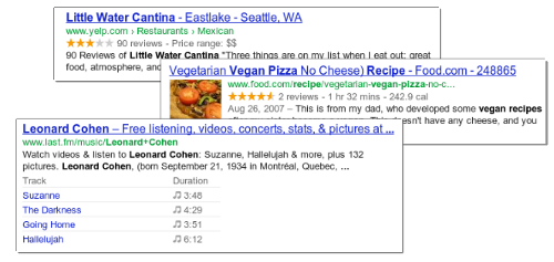
Traditional, text-only, search result snippets aim to summarize the content of a page in our search results. Rich snippets (shown above) allow webmasters to help us provide even better summaries using structured data markup that they can add to their pages. Today we're introducing a set of guidelines to help you implement high quality structured data markup for rich snippets.
Once you've correctly added structured data markup to you site, rich snippets are generated algorithmically based on that markup. If the markup on a page offers an accurate description of the page's content, is up-to-date, and is visible and easily discoverable on your page and by users, our algorithms are more likely to decide to show a rich snippet in Google’s search results.
Alternatively, if the rich snippets markup on a page is spammy, misleading, or otherwise abusive, our algorithms are much more likely to ignore the markup and render a text-only snippet. Keep in mind that, while rich snippets are generated algorithmically, we do reserve the right to take manual action (e.g., disable rich snippets for a specific site) in cases where we see actions that hurt the experience for our users.
To illustrate these guidelines with some examples:
- If your page is about a band, make sure you mark up concerts being performed by that band, not by related bands or bands in the same town.
- If you sell products through your site, make sure reviews on each page are about that page's product and not the store itself.
- If your site provides song lyrics, make sure reviews are about the quality of the lyrics, not the quality of the song itself.
Tuesday, October 2, 2012
Google Webmaster Guidelines updated
Webmaster level: All
Today we’re happy to announce an updated version of our Webmaster Quality Guidelines. Both our basic quality guidelines and many of our more specific articles (like those on links schemes or hidden text) have been reorganized and expanded to provide you with more information about how to create quality websites for both users and Google.
The main message of our quality guidelines hasn’t changed: Focus on the user. However, we’ve added more guidance and examples of behavior that you should avoid in order to keep your site in good standing with Google’s search results. We’ve also added a set of quality and technical guidelines for rich snippets, as structured markup is becoming increasingly popular.
We hope these updated guidelines will give you a better understanding of how to create and maintain Google-friendly websites.
Monday, October 1, 2012
Keeping you informed of critical website issues
Webmaster level: All
Having a healthy and well-performing website is important, both to you as the webmaster and to your users. When we discover critical issues with a website, Webmaster Tools will now let you know by automatically sending an email with more information.
We’ll only notify you about issues that we think have significant impact on your site’s health or search performance and which have clear actions that you can take to address the issue. For example, we’ll email you if we detect malware on your site or see a significant increase in errors while crawling your site.
For most sites these kinds of issues will occur rarely. If your site does happen to have an issue, we cap the number of emails we send over a certain period of time to avoid flooding your inbox. If you don’t want to receive any email from Webmaster Tools you can change your email delivery preferences.
We hope that you find this change a useful way to stay up-to-date on critical and important issues regarding your site’s health. If you have any questions, please let us know via our Webmaster Help Forum.
Thursday, September 20, 2012
Structured Data Testing Tool
Webmaster level: All
Today we’re excited to share the launch of a shiny new version of the rich snippet testing tool, now called the structured data testing tool. The major improvements are:

The new structured data testing tool works with all supported rich snippets and authorship markup, including applications, products, recipes, reviews, and others.
Try it yourself and, as always, if you have any questions or feedback, please tell us in the Webmaster Help Forum.
Written by Yong Zhu on behalf of the rich snippets testing tool team
Today we’re excited to share the launch of a shiny new version of the rich snippet testing tool, now called the structured data testing tool. The major improvements are:
- We’ve improved how we display rich snippets in the testing tool to better match how they appear in search results.
- The brand new visual design makes it clearer what structured data we can extract from the page, and how that may be shown in our search results.
- The tool is now available in languages other than English to help webmasters from around the world build structured-data-enabled websites.
The new structured data testing tool works with all supported rich snippets and authorship markup, including applications, products, recipes, reviews, and others.
Try it yourself and, as always, if you have any questions or feedback, please tell us in the Webmaster Help Forum.
Written by Yong Zhu on behalf of the rich snippets testing tool team
Thursday, August 9, 2012
Website testing & Google search
Webmaster level: Advanced
We’ve gotten several questions recently about whether website testing—such as A/B or multivariate testing—affects a site’s performance in search results. We’re glad you’re asking, because we’re glad you’re testing! A/B and multivariate testing are great ways of making sure that what you’re offering really appeals to your users.
Before we dig into the implications for search, a brief primer:
Website testing is when you try out different versions of your website (or a part of your website), and collect data about how users react to each version. You use software to track which version causes users to do-what-you-want-them-to-do most often: which one results in the most purchases, or the most email signups, or whatever you’re testing for. After the test is finished you can update your website to use the “winner” of the test—the most effective content.
A/B testing is when you run a test by creating multiple versions of a page, each with its own URL. When users try to access the original URL, you redirect some of them to each of the variation URLs and then compare users’ behaviour to see which page is most effective.
Multivariate testing is when you use software to change differents parts of your website on the fly. You can test changes to multiple parts of a page—say, the heading, a photo, and the ‘Add to Cart’ button—and the software will show variations of each of these sections to users in different combinations and then statistically analyze which variations are the most effective. Only one URL is involved; the variations are inserted dynamically on the page.
So how does this affect what Googlebot sees on your site? Will serving different content variants change how your site ranks? Below are some guidelines for running an effective test with minimal impact on your site’s search performance.
To learn more about website testing, check out these articles on Content Experiments, our free testing tool in Google Analytics. You can also ask questions about website testing in the Analytics Help Forum, or about search impact in the Webmaster Help Forum.
We’ve gotten several questions recently about whether website testing—such as A/B or multivariate testing—affects a site’s performance in search results. We’re glad you’re asking, because we’re glad you’re testing! A/B and multivariate testing are great ways of making sure that what you’re offering really appeals to your users.
Before we dig into the implications for search, a brief primer:
Website testing is when you try out different versions of your website (or a part of your website), and collect data about how users react to each version. You use software to track which version causes users to do-what-you-want-them-to-do most often: which one results in the most purchases, or the most email signups, or whatever you’re testing for. After the test is finished you can update your website to use the “winner” of the test—the most effective content.
A/B testing is when you run a test by creating multiple versions of a page, each with its own URL. When users try to access the original URL, you redirect some of them to each of the variation URLs and then compare users’ behaviour to see which page is most effective.
Multivariate testing is when you use software to change differents parts of your website on the fly. You can test changes to multiple parts of a page—say, the heading, a photo, and the ‘Add to Cart’ button—and the software will show variations of each of these sections to users in different combinations and then statistically analyze which variations are the most effective. Only one URL is involved; the variations are inserted dynamically on the page.
So how does this affect what Googlebot sees on your site? Will serving different content variants change how your site ranks? Below are some guidelines for running an effective test with minimal impact on your site’s search performance.
- No cloaking.
Cloaking—showing one set of content to humans, and a different set to Googlebot—is against our Webmaster Guidelines, whether you’re running a test or not. Make sure that you’re not deciding whether to serve the test, or which content variant to serve, based on user-agent. An example of this would be always serving the original content when you see the user-agent “Googlebot.” Remember that infringing our Guidelines can get your site demoted or removed from Google search results—probably not the desired outcome of your test. - Use rel=“canonical”.
If you’re running an A/B test with multiple URLs, you can use the rel=“canonical” link attribute on all of your alternate URLs to indicate that the original URL is the preferred version. We recommend using rel=“canonical” rather than a noindex meta tag because it more closely matches your intent in this situation. Let’s say you were testing variations of your homepage; you don’t want search engines to not index your homepage, you just want them to understand that all the test URLs are close duplicates or variations on the original URL and should be grouped as such, with the original URL as the canonical. Using noindex rather than rel=“canonical” in such a situation can sometimes have unexpected effects (e.g., if for some reason we choose one of the variant URLs as the canonical, the “original” URL might also get dropped from the index since it would get treated as a duplicate). - Use 302s, not 301s.
If you’re running an A/B test that redirects users from the original URL to a variation URL, use a 302 (temporary) redirect, not a 301 (permanent) redirect. This tells search engines that this redirect is temporary—it will only be in place as long as you’re running the experiment—and that they should keep the original URL in their index rather than replacing it with the target of the redirect (the test page). JavaScript-based redirects are also fine. - Only run the experiment as long as necessary.
The amount of time required for a reliable test will vary depending on factors like your conversion rates, and how much traffic your website gets; a good testing tool should tell you when you’ve gathered enough data to draw a reliable conclusion. Once you’ve concluded the test, you should update your site with the desired content variation(s) and remove all elements of the test as soon as possible, such as alternate URLs or testing scripts and markup. If we discover a site running an experiment for an unnecessarily long time, we may interpret this as an attempt to deceive search engines and take action accordingly. This is especially true if you’re serving one content variant to a large percentage of your users.
To learn more about website testing, check out these articles on Content Experiments, our free testing tool in Google Analytics. You can also ask questions about website testing in the Analytics Help Forum, or about search impact in the Webmaster Help Forum.
Tuesday, July 31, 2012
Introducing the Structured Data Dashboard
Webmaster level: All
Structured data is becoming an increasingly important part of the web ecosystem. Google makes use of structured data in a number of ways including rich snippets which allow websites to highlight specific types of content in search results. Websites participate by marking up their content using industry-standard formats and schemas.
To provide webmasters with greater visibility into the structured data that Google knows about for their website, we’re introducing today a new feature in Webmaster Tools - the Structured Data Dashboard. The Structured Data Dashboard has three views: site, item type and page-level.
Site-level view
At the top level, the Structured Data Dashboard, which is under Optimization, aggregates this data (by root item type and vocabulary schema). Root item type means an item that is not an attribute of another on the same page. For example, the site below has about 2 million Schema.Org annotations for Books (“http://schema.org/Book”)

Itemtype-level view
It also provides per-page details for each item type, as seen below:

Google parses and stores a fixed number of pages for each site and item type. They are stored in decreasing order by the time in which they were crawled. We also keep all their structured data markup. For certain item types we also provide specialized preview columns as seen in this example below (e.g. “Name” is specific to schema.org Product).

The default sort order is such that it would facilitate inspection of the most recently added Structured Data.
Page-level view
Last but not least, we have a details page showing all attributes of every item type on the given page (as well as a link to the Rich Snippet testing tool for the page in question).

Webmasters can use the Structured Data Dashboard to verify that Google is picking up new markup, as well as to detect problems with existing markup, for example monitor potential changes in instance counts during site redesigns.
Thursday, July 12, 2012
New Crawl Error alerts from Webmaster Tools
Webmaster level: All
Today we’re rolling out Crawl Error alerts to help keep you informed of the state of your site.
Since Googlebot regularly visits your site, we know when your site exhibits connectivity issues or suddenly spikes in pages returning HTTP error response codes (e.g. 404 File Not Found, 403 Forbidden, 503 Service Unavailable, etc). If your site is timing out or is exhibiting systemic errors when accessed by Googlebot, other visitors to your site might be having the same problem!
When we see such errors, we may send alerts –- in the form of messages in the Webmaster Tools Message Center –- to let you know what we’ve detected. Hopefully, given this increased communication, you can fix potential issues that may otherwise impact your site’s visitors or your site’s presence in search.
As we discussed in our blog post announcing the new Webmaster Tools Crawl Errors feature, we divide crawl errors into two types: Site Errors and URL Errors.
The alert provides the number of errors Googlebot encountered crawling your site, the overall crawl error connection rate for your site, a link to the appropriate section of Webmaster Tools to examine the data more closely, and suggestions as to how to fix the problem.
If your site shows a 100% error rate in one of these categories, it likely means that your site is either down or misconfigured in some way. If your site has an error rate less than 100% in any of these categories, it could just indicate a transient condition, but it could also mean that your site is overloaded or improperly configured. You may want to investigate these issues further, or ask about them on our forum.
We may alert you even if the overall error rate is very low — in our experience a well configured site shouldn’t have any errors in these categories.
That’s why for URL Errors we only send alerts when we detect a large spike in the number of errors for any of the five categories of errors (Server error, Soft 404, Access denied, Not found or Not followed). For example, if your site routinely has 100 pages with 404 errors, we won’t alert you if that number fluctuates minimally. However we might notify you when that count reaches a much higher number, say 500 or 1,000. Keep in mind that seeing 404 errors is not always bad, and can be a natural part of a healthy website (see our previous blog post: Do 404s hurt my site?).
A large spike in error count could be because something has changed on your site — perhaps a reconfiguration has changed the permissions for a section of your site, or a new version of a script is crashing regularly, or someone accidentally moved or deleted an entire directory, or a reorganization of your site causes external links to no longer work. It could also just be a transient spike, or could be because of external causes (someone has linked to non-existent pages), so there might not even be a problem; but when we see an unusually large number of errors for your site, we’ll let you know so you can investigate:
The alert describes the category of web errors for which we’ve detected a spike, gives a link to the appropriate section of Webmaster Tools so that you can see what pages we think are problematic, and offers troubleshooting suggestions.
Let us know what you think, and if you have any comments or suggestions on our new alerts please visit our forum.
Today we’re rolling out Crawl Error alerts to help keep you informed of the state of your site.
Since Googlebot regularly visits your site, we know when your site exhibits connectivity issues or suddenly spikes in pages returning HTTP error response codes (e.g. 404 File Not Found, 403 Forbidden, 503 Service Unavailable, etc). If your site is timing out or is exhibiting systemic errors when accessed by Googlebot, other visitors to your site might be having the same problem!
When we see such errors, we may send alerts –- in the form of messages in the Webmaster Tools Message Center –- to let you know what we’ve detected. Hopefully, given this increased communication, you can fix potential issues that may otherwise impact your site’s visitors or your site’s presence in search.
As we discussed in our blog post announcing the new Webmaster Tools Crawl Errors feature, we divide crawl errors into two types: Site Errors and URL Errors.
Site Error alerts for major site-wide problems
Site Errors represent an inability to connect to your site, and represent systemic issues rather than problems with specific pages. Here are some issues that might cause Site Errors:- Your DNS server is down or misconfigured.
- Your web server itself is firewalled off.
- Your web server is refusing connections from Googlebot.
- Your web server is overloaded, or down.
- Your site’s robots.txt is inaccessible.
 |
| Example of a Site Error alert |
If your site shows a 100% error rate in one of these categories, it likely means that your site is either down or misconfigured in some way. If your site has an error rate less than 100% in any of these categories, it could just indicate a transient condition, but it could also mean that your site is overloaded or improperly configured. You may want to investigate these issues further, or ask about them on our forum.
We may alert you even if the overall error rate is very low — in our experience a well configured site shouldn’t have any errors in these categories.
URL Error anomaly alerts for potentially less critical issues
Whereas any appreciable number of Site Errors could indicate that your site is misconfigured, overloaded, or simply out of service, URL Errors (pages that return a non-200 HTTP code, or incorrectly return an HTTP 200 code in the case of soft 404 errors) may occur on any well-configured site. Because different sites have different numbers of pages and different numbers of external links, a count of errors that indicates a serious problem for a small site might be entirely normal for a large site.That’s why for URL Errors we only send alerts when we detect a large spike in the number of errors for any of the five categories of errors (Server error, Soft 404, Access denied, Not found or Not followed). For example, if your site routinely has 100 pages with 404 errors, we won’t alert you if that number fluctuates minimally. However we might notify you when that count reaches a much higher number, say 500 or 1,000. Keep in mind that seeing 404 errors is not always bad, and can be a natural part of a healthy website (see our previous blog post: Do 404s hurt my site?).
A large spike in error count could be because something has changed on your site — perhaps a reconfiguration has changed the permissions for a section of your site, or a new version of a script is crashing regularly, or someone accidentally moved or deleted an entire directory, or a reorganization of your site causes external links to no longer work. It could also just be a transient spike, or could be because of external causes (someone has linked to non-existent pages), so there might not even be a problem; but when we see an unusually large number of errors for your site, we’ll let you know so you can investigate:
 |
| Example of a URL Error anomaly alert |
Enable Message forwarding to send alerts to your inbox
We know you’re busy, and that routinely checking Webmaster Tools just to check for new alerts might be something you forget to do. Consider turning on Message forwarding. We’ll send any Webmaster Tools messages to the email address of your choice.Let us know what you think, and if you have any comments or suggestions on our new alerts please visit our forum.
Thursday, June 28, 2012
Adding associates to manage your YouTube presence
Webmaster level: All
Many organizations have multiple presences on the web. For example, Webmaster Tools lives at www.google.com/webmasters, but it also has a Twitter account and a YouTube channel. It's important that visitors to these other properties have confidence that they are actually associated with the Webmaster Tools site. However to date it has been challenging for webmasters to manage which users can take actions on behalf of their site in different services.
Today we're happy to announce a new feature in Webmaster Tools that allows webmasters to add "associates" -- trusted users who can act on behalf of your site in other Google products. Unlike site owners and users, associates can't view site data or take any site actions in Webmaster Tools, but they are authorized to perform specific tasks in other products.
For this initial launch, members of YouTube's partner program that have created a YouTube channel for their site can now link the two together. By doing this, your YouTube channel will be displayed as the "official channel" for your website.

If you have more questions, please see the Help with Associates article or visit our webmaster help forum.
Many organizations have multiple presences on the web. For example, Webmaster Tools lives at www.google.com/webmasters, but it also has a Twitter account and a YouTube channel. It's important that visitors to these other properties have confidence that they are actually associated with the Webmaster Tools site. However to date it has been challenging for webmasters to manage which users can take actions on behalf of their site in different services.
Today we're happy to announce a new feature in Webmaster Tools that allows webmasters to add "associates" -- trusted users who can act on behalf of your site in other Google products. Unlike site owners and users, associates can't view site data or take any site actions in Webmaster Tools, but they are authorized to perform specific tasks in other products.
For this initial launch, members of YouTube's partner program that have created a YouTube channel for their site can now link the two together. By doing this, your YouTube channel will be displayed as the "official channel" for your website.
Management within Webmaster Tools
To add or change associates:
- On the Webmaster Tools home page, click the site you want.
- Under Configuration, click Associates.
- Click Add a new associate.
- In the text box, type the email address of the person you want to add.
- Select the type of association you want.
- Click Add.


Management within YouTube
It’s also possible for users to request association from a site’s webmaster.- Log in to your YouTube partner account.
- Click on the user menu and choose Settings > Associated Website.
- Fill in the page you would like to associate your channel with.
- Click Add. If you’re a verified owner of the site, you’re done. But if someone else in your organization manages the website, the association will be marked Pending. The owner receives a notification with an option to approve or deny the request.
- After approval is granted, navigate back to this page and click Refresh to complete the association.


If you have more questions, please see the Help with Associates article or visit our webmaster help forum.
Wednesday, June 6, 2012
Recommendations for building smartphone-optimized websites
Webmaster level: All
Every day more and more smartphones get activated and more websites are producing smartphone-optimized content. Since we last talked about how to build mobile-friendly websites, we’ve been working hard on improving Google’s support for smartphone-optimized content. As part of this effort, we launched Googlebot-Mobile for smartphones back in December 2011, which is specifically tasked with identifying such content.
Today we’d like to give you Google’s recommendations for building smartphone-optimized websites and explain how to do so in a way that gives both your desktop- and smartphone-optimized sites the best chance of performing well in Google’s search results.
Recommendations for smartphone-optimized sites
The full details of our recommendation can be found in our new help site, which we now summarize.
When building a website that targets smartphones, Google supports three different configurations:
Sites that use responsive web design, i.e. sites that serve all devices on the same set of URLs, with each URL serving the same HTML to all devices and using just CSS to change how the page is rendered on the device. This is Google’s recommended configuration.
Sites that dynamically serve all devices on the same set of URLs, but each URL serves different HTML (and CSS) depending on whether the user agent is a desktop or a mobile device.
Sites that have a separate mobile and desktop sites.
Responsive web design
Responsive web design is a technique to build web pages that alter how they look using CSS3 media queries. That is, there is one HTML code for the page regardless of the device accessing it, but its presentation changes using CSS media queries to specify which CSS rules apply for the browser displaying the page. You can learn more about responsive web design from this blog post by Google's webmasters and in our recommendations.
Using responsive web design has multiple advantages, including:
It keeps your desktop and mobile content on a single URL, which is easier for your users to interact with, share, and link to and for Google’s algorithms to assign the indexing properties to your content.
Google can discover your content more efficiently as we wouldn't need to crawl a page with the different Googlebot user agents to retrieve and index all the content.
Device-specific HTML
However, we appreciate that for many situations it may not be possible or appropriate to use responsive web design. That’s why we support having websites serve equivalent content using different, device-specific, HTML. The device-specific HTML can be served on the same URL (a configuration called dynamic serving) or different URLs (such as www.example.com and m.example.com).
If your website uses a dynamic serving configuration, we strongly recommend using the Vary HTTP header to communicate to caching servers and our algorithms that the content may change for different user agents requesting the page. We also use this as a crawling signal for Googlebot-Mobile. More details are here.
As for the separate mobile site configuration, since there are many ways to do this, our recommendation introduces annotations that communicate to our algorithms that your desktop and mobile pages are equivalent in purpose; that is, the new annotations describe the relationship between the desktop and mobile content as alternatives of each other and should be treated as a single entity with each alternative targeting a specific class of device.
These annotations will help us discover your smartphone-optimized content and help our algorithms understand the structure of your content, giving it the best chance of performing well in our search results.
Conclusion
This blog post is only a brief summary of our recommendation for building smartphone-optimized websites. Please read the full recommendation and see which supported implementation is most suitable for your site and users. And, as always, please ask on our Webmaster Help forums if you have more questions.
Monday, June 4, 2012
Easier domain verification
Webmaster level: All
Today we’re announcing a new initiative that makes it easier for users to verify domains for Google services like Webmaster Tools and Google Apps.
First, some background on this initiative. To use certain Google services with your website or domain, you currently have to verify that you own the site or domain, since these services can share sensitive data (like search queries) or operate Internet-facing services (like hosted email) on your behalf.
One of our supported verification methods is domain verification. Currently this method requires a user to manually create a DNS TXT record to prove their ownership. For many users, this can be challenging and difficult to do.
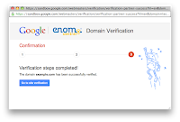
So now, in collaboration with Go Daddy and eNom, we’re introducing a simple, automated solution for domain verification that guides you through the process in a few easy steps.
If your domain name records are managed by eNom or Go Daddy, in the Google site verification interface you will see a new, easier verification method as shown below.


Selecting this method launches a pop-up window that asks you to log in to the provider using your existing account with them.


The first time you log in, you’ll be asked to authorize the provider to access the Google site verification service on your behalf.


Next you’ll be asked to confirm that you wish to verify the domain.


And that’s it! After a few seconds, your domain should be automatically verified and a confirmation message displayed.

Now eNom and Go Daddy customers can more quickly and easily verify their domains to use with Google services like Webmaster Tools and Google Apps.
We’re also happy to share that Bluehost customers will be able to enjoy the same capability in the near future. And we look forward to working with more partners to bring easier domain verification to even more users. (Interested parties can contact us via this form.)
If you have any questions or feedback, as always please let us know via our webmaster help forum.
Today we’re announcing a new initiative that makes it easier for users to verify domains for Google services like Webmaster Tools and Google Apps.
First, some background on this initiative. To use certain Google services with your website or domain, you currently have to verify that you own the site or domain, since these services can share sensitive data (like search queries) or operate Internet-facing services (like hosted email) on your behalf.
One of our supported verification methods is domain verification. Currently this method requires a user to manually create a DNS TXT record to prove their ownership. For many users, this can be challenging and difficult to do.
So now, in collaboration with Go Daddy and eNom, we’re introducing a simple, automated solution for domain verification that guides you through the process in a few easy steps.
If your domain name records are managed by eNom or Go Daddy, in the Google site verification interface you will see a new, easier verification method as shown below.


Selecting this method launches a pop-up window that asks you to log in to the provider using your existing account with them.


The first time you log in, you’ll be asked to authorize the provider to access the Google site verification service on your behalf.


Next you’ll be asked to confirm that you wish to verify the domain.


And that’s it! After a few seconds, your domain should be automatically verified and a confirmation message displayed.


Now eNom and Go Daddy customers can more quickly and easily verify their domains to use with Google services like Webmaster Tools and Google Apps.
We’re also happy to share that Bluehost customers will be able to enjoy the same capability in the near future. And we look forward to working with more partners to bring easier domain verification to even more users. (Interested parties can contact us via this form.)
If you have any questions or feedback, as always please let us know via our webmaster help forum.
Wednesday, May 30, 2012
Now you can polish up Google’s translation of your website
Webmaster level: All
(Cross-posted on the Google Translate Blog)
Since we first launched the Website Translator plugin back in September 2009, more than a million websites have added the plugin. While we’ve kept improving our machine translation system since then, we may not reach perfection until someone invents full-blown Artificial Intelligence. In other words, you’ll still sometimes run into translations we didn’t get quite right.
So today, we’re launching a new experimental feature (in beta) that lets you customize and improve the way the Website Translator translates your site. Once you add the customization meta tag to a webpage, visitors will see your customized translations whenever they translate the page, even when they use the translation feature in Chrome and Google Toolbar. They’ll also now be able to ‘suggest a better translation’ when they notice a translation that’s not quite right, and later you can accept and use that suggestion on your site.
To get started:
- Add the Website Translator plugin and customization meta tag to your website
- Then translate a page into one of 60+ languages using the Website Translator
- Hover over a translated sentence to display the original text
- Click on ‘Contribute a better translation’
- And finally, click on a phrase to choose an automatic alternative translation -- or just double-click to edit the translation directly.
If you’re signed in, the corrections made on your site will go live right away -- the next time a visitor translates a page on your website, they’ll see your correction. If one of your visitors contributes a better translation, the suggestion will wait until you approve it. You can also invite other editors to make corrections and add translation glossary entries. You can learn more about these new features in the Help Center.
This new experimental feature is currently free of charge. We hope this feature, along with Translator Toolkit and the Translate API, can provide a low cost way to expand your reach globally and help to break down language barriers.
Thursday, May 24, 2012
Multilingual and multinational site annotations in Sitemaps
Webmaster level: All
In December 2011 we announced annotations for sites that target users in many languages and, optionally, countries. These annotations define a cluster of equivalent pages that target users around the world, and were implemented using rel-alternate-hreflang link elements in the HTML of each page in the cluster.
Based on webmaster feedback and other considerations, today we’re adding support for specifying the rel-alternate-hreflang annotations in Sitemaps. Using Sitemaps instead of HTML link elements offers many advantages including smaller page size and easier deployment for some websites.
To see how this works, let's take a simple example: We wish to specify that for the URL http://www.example.com/en, targeting English language users, the equivalent URL targeting German language speakers http://www.example.com/de. Up till now, the only way to add such annotation is to use a link element, either as an HTTP header or as HTML elements on both URLs like this:
<link rel="alternate" hreflang="en" href="http://www.example.com/en" >
<link rel="alternate" hreflang="de" href="http://www.example.com/de" >
As of today, you can alternately use the following equivalent markup in Sitemaps:
<url>
  <loc>http://www.example.com/en</loc>
  <xhtml:link
    rel="alternate"
    hreflang="de"
    href="http://www.example.com/de" />
  <xhtml:link
    rel="alternate"
    hreflang="en"
    href="http://www.example.com/en" />
</url>
<url>
  <loc>http://www.example.com/de</loc>
  <xhtml:link
    rel="alternate"
    hreflang="de"
    href="http://www.example.com/de" />
  <xhtml:link
    rel="alternate"
    hreflang="en"
    href="http://www.example.com/en" />
</url>
Briefly, the new Sitemaps tags shown in bold function in the same way as the HTML link tags, with both using the same attributes. The full technical details of how the annotations are implemented in Sitemaps, including how to implement the xhtml namespace for the link tag, are in our new Help Center article.
A more detailed example can be found in our new Help Center article, and if you need more help, please ask in our brand new internationalization help forum.
Thursday, May 17, 2012
Making more pages load instantly
Webmaster level: All
At Google we're obsessed with speed. We've long known that even seemingly minor speed increases can have surprisingly large impacts on user engagement and happiness. About a year ago we rolled out Instant Pages in pursuit of that goal. Instant Pages makes use of prerendering technology in Chrome to make your site appear to load instantly in some cases, with no need for any extra work on your part. Here's a video of it in action:
We've been closely watching performance and listening to webmaster feedback. Since Instant Pages rolled out we've saved more than a thousand years of ours users' time. We're very happy with the results so far, and we'll be gradually increasing how often we trigger the feature.
In the vast majority of cases, webmasters don't have to do anything for their sites to work correctly with prerendering. As we mentioned in our initial announcement of Instant Pages, search traffic will be measured in Webmaster Tools just like before this feature: only results the user visits will be counted. If your site keeps track of pageviews on its own, you might be interested in the Page Visibility API, which allows you to detect when prerendering is occurring and factor those out of your statistics. If you use an ads or analytics package, check with them to see if their solution is already prerender-aware; if it is, in many cases you won't need to make any changes at all. If you're interested in triggering Chrome's prerendering within your own site, see the Prerendering in Chrome article.
Instant Pages means that users arrive at your site happier and more engaged, which is great for everyone.
Tuesday, May 8, 2012
Sorting and Filtering Results in Custom Search
Webmaster level: All
(Cross-posted on the Custom Search Blog)
Using Custom Search Engine (CSE), you can create rich search experiences that make it easier for visitors to find the information they’re looking for on your site. Today we’re announcing two improvements to sorting and filtering of search results in CSE.
First, CSE now supports UI-based results sorting, which you can enable in the Basics tab of the CSE control panel. Once you’ve updated the CSE element code on your site, a “sort by” picker will become visible at the top of the results section.

By default CSE supports sorting by date and relevance. In the control panel, you can specify additional “sort by” keys that are based on the structure of your site’s content, giving users more options to find the results that are most relevant to them. For example, if you’ve marked up pages for product rich snippets, you could enable sorting based on price as shown below:

Second, we’re introducing compact queries for filtering by attribute. Currently you can issue a query like
[more:pagemap:product-description:search more:pagemap:product-description:engine]
which will only show pages with a ‘product-description’ attribute that contains both ‘search’ and ‘engine’.
With a compact query, you can issue the same request as:
[more:p:product-description:search*engine]
We hope these new features help you create richer and more useful search experiences for your visitors. As always, if you have any questions or feedback please let us know via our Help Forum.
Monday, May 7, 2012
Navigation, Dashboard and Home page
Webmaster level: All
After announcing Webmaster Tools spring cleaning earlier this quarter, it’s time to do the job. There are a few changes coming along: an updated navigation, revamped dashboard, and a compact view for the home page site-list.
We’ve regrouped the features in Webmaster Tools to create an improved navigation structure (shown on the left-hand side of the above image). We distinguished the following groups: Configuration, Health, Traffic and Optimization. Each group represents a related set of functionality:
If you have a moment, please take time to familiarize yourself with the new Webmaster Tools navigation. Some features were slightly renamed, such as HTML Suggestions became HTML Improvements, however the functionality remains the same.
Hoping you’ll find the new navigation useful, we also think you’ll like the new Dashboard. At the top of the Dashboard you can see recent, important, prioritized messages regarding your site. Just below that, you’ll find another section which provides a brief summary of the current status of your site. There are three widgets displayed: Crawl Errors, Search Queries and Sitemaps, each representing a different navigation group: Health, Traffic and Optimization (respectively). We know your time is valuable. With the new Dashboard, we've surfaced more messages and charts to let you see how your site is doing at a glance. Take a quick look before diving into the details.
Finally, those of you who manage a large number of sites can choose to view your site-list in a 'Compact' layout, without the large site-preview thumbnails. Don't worry, if you want the more expanded layout you can always switch back.
If you have questions or comments about these changes please post them in our Help Forum.
After announcing Webmaster Tools spring cleaning earlier this quarter, it’s time to do the job. There are a few changes coming along: an updated navigation, revamped dashboard, and a compact view for the home page site-list.
 |
| Here's the new sample Webmaster Tools Dashboard for www.example.com |
We’ve regrouped the features in Webmaster Tools to create an improved navigation structure (shown on the left-hand side of the above image). We distinguished the following groups: Configuration, Health, Traffic and Optimization. Each group represents a related set of functionality:
- Configuration: Things you configure and generally don’t change very often.
- Health: Where you look to make sure things are OK.
- Traffic: Where you go to understand how your site is doing in Google search, who’s linking to you; where you can explore the data about your site.
- Optimization: Where you can find ideas to enhance your site, which enables us to better understand and represent your site in Search and other services.
If you have a moment, please take time to familiarize yourself with the new Webmaster Tools navigation. Some features were slightly renamed, such as HTML Suggestions became HTML Improvements, however the functionality remains the same.
Hoping you’ll find the new navigation useful, we also think you’ll like the new Dashboard. At the top of the Dashboard you can see recent, important, prioritized messages regarding your site. Just below that, you’ll find another section which provides a brief summary of the current status of your site. There are three widgets displayed: Crawl Errors, Search Queries and Sitemaps, each representing a different navigation group: Health, Traffic and Optimization (respectively). We know your time is valuable. With the new Dashboard, we've surfaced more messages and charts to let you see how your site is doing at a glance. Take a quick look before diving into the details.
Finally, those of you who manage a large number of sites can choose to view your site-list in a 'Compact' layout, without the large site-preview thumbnails. Don't worry, if you want the more expanded layout you can always switch back.
 |
Compact layout of the Home page |
If you have questions or comments about these changes please post them in our Help Forum.
Wednesday, May 2, 2012
Coding guidelines for HTML and CSS
Webmaster level: All
Great code has many attributes. It’s effective, efficient, maintainable, elegant. When working on code with many developers and teams and maybe even companies, great code needs to also be consistent and easy to understand. For that purpose there are style guides. We use style guides for a lot of languages, and our newest public style guide is the Google HTML and CSS Style Guide.
Our HTML and CSS Style Guide, just like other Google style guides, deals with a lot of formatting-related matters. It also hints at best practices so to encourage developers to go beyond indentation. Many style guide authors know the underlying motivation from the question whether to describe the code they write—or to prescribe what code they want to write. Not surprisingly then, in our HTML and CSS style guide you’ll find both (as much as you’ll still find a lot of different development styles in our not entirely small code base).
At this time we only want to introduce you to this new style guide. We hope to share more about its design decisions and future updates with you. In the meantime please share your thoughts and experiences, and as with the other style guides, feel free to use our style guide for your own projects, as you see fit.
Monday, April 30, 2012
Responsive design – harnessing the power of media queries
Webmaster Level: Intermediate / Advanced
We love data, and spend a lot of time monitoring the analytics on our websites. Any web developer doing the same will have noticed the increase in traffic from mobile devices of late. Over the past year we’ve seen many key sites garner a significant percentage of pageviews from smartphones and tablets. These represent large numbers of visitors, with sophisticated browsers which support the latest HTML, CSS, and JavaScript, but which also have limited screen space with widths as narrow as 320 pixels.
Our commitment to accessibility means we strive to provide a good browsing experience for all our users. We faced a stark choice between creating mobile specific websites, or adapting existing sites and new launches to render well on both desktop and mobile. Creating two sites would allow us to better target specific hardware, but maintaining a single shared site preserves a canonical URL, avoiding any complicated redirects, and simplifies the sharing of web addresses. With a mind towards maintainability we leant towards using the same pages for both, and started thinking about how we could fulfill the following guidelines:

Stacked content, tweaked navigation and rescaled images – Chromebooks
As a starting point, simple, semantic markup gives us pages which are more flexible and easier to reflow if the layout needs to be changed. By ensuring the stylesheet enables a liquid layout, we're already on the road to mobile-friendliness. Instead of specifying
Liquid layout is a good start, but can lack a certain finesse. Thankfully media queries are now well-supported in modern browsers including IE9+ and most mobile devices. These can make the difference between a site that degrades well on a mobile browser, vs. one that is enhanced to take advantage of the streamlined UI. But first we have to take into account how smartphones represent themselves to web servers.
When is a pixel not a pixel? When it’s on a smartphone. By default, smartphone browsers pretend to be high-resolution desktop browsers, and lay out a page as if you were viewing it on a desktop monitor. This is why you get a tiny-text “overview mode” that’s impossible to read before zooming in. The default viewport width for the default Android browser is 800px, and 980px for iOS, regardless of the number of actual physical pixels on the screen.
In order to trigger the browser to render your page at a more readable scale, you need to use the viewport meta element:
Mobile screen resolutions vary widely, but most modern smartphone browsers currently report a standard
The useful thing about setting the
In reality you may find you need to use different breakpoints depending on how your site flows and looks on various devices. You can also use the

Stacked content, smaller images – Cultural Institute
We recently re-launched the About Google page. Apart from setting up a liquid layout, we added a few media queries to provide an improved experience on smaller screens, like those on a tablet or smartphone.
Instead of targeting specific device resolutions we went with a relatively broad set of breakpoints. For a screen resolution wider than 1024 pixels, we render the page as it was originally designed, according to our 12-column grid. Between 801px and 1024px, you get to see a slightly squished version thanks to the liquid layout.
Only if the screen resolution drops to 800 pixels will content that’s not considered core content be sent to the bottom of the page:
With a final media query we enter smartphone territory:
At this point, we’re not loading the large image anymore and we stack the content blocks. We also added additional whitespace between the content items so they are more easily identified as different sections.
With these simple measures we made sure the site is usable on a wide range of devices.

Stacked content and the removal of large image – About Google
It’s worth bearing in mind that there’s no simple solution to making sites accessible on mobile devices and narrow viewports. Liquid layouts are a great starting point, but some design compromises may need to be made. Media queries are a useful way of adding polish for many devices, but remember that 25% of visits are made from those desktop browsers that do not currently support the technique and there are some performance implications. And if you have a fancy widget on your site, it might work beautifully with a mouse, but not so great on a touch device where fine control is more difficult.
The key is to test early and test often. Any time spent surfing your own sites with a smartphone or tablet will prove invaluable. When you can’t test on real devices, use the Android SDK or iOS Simulator. Ask friends and colleagues to view your sites on their devices, and watch how they interact too.
Mobile browsers are a great source of new traffic, and learning how best to support them is an exciting new area of professional development.
Some more examples of responsive design at Google:
We love data, and spend a lot of time monitoring the analytics on our websites. Any web developer doing the same will have noticed the increase in traffic from mobile devices of late. Over the past year we’ve seen many key sites garner a significant percentage of pageviews from smartphones and tablets. These represent large numbers of visitors, with sophisticated browsers which support the latest HTML, CSS, and JavaScript, but which also have limited screen space with widths as narrow as 320 pixels.
Our commitment to accessibility means we strive to provide a good browsing experience for all our users. We faced a stark choice between creating mobile specific websites, or adapting existing sites and new launches to render well on both desktop and mobile. Creating two sites would allow us to better target specific hardware, but maintaining a single shared site preserves a canonical URL, avoiding any complicated redirects, and simplifies the sharing of web addresses. With a mind towards maintainability we leant towards using the same pages for both, and started thinking about how we could fulfill the following guidelines:
- Our pages should render legibly at any screen resolution
- We mark up one set of content, making it viewable on any device
- We should never show a horizontal scrollbar, whatever the window size

Stacked content, tweaked navigation and rescaled images – Chromebooks
Implementation
As a starting point, simple, semantic markup gives us pages which are more flexible and easier to reflow if the layout needs to be changed. By ensuring the stylesheet enables a liquid layout, we're already on the road to mobile-friendliness. Instead of specifying
width for container elements, we started using max-width instead. In place of height we used min-height, so larger fonts or multi-line text don’t break the container’s boundaries. To prevent fixed width images “propping open” liquid columns, we apply the following CSS rule:img {
max-width: 100%;
}Liquid layout is a good start, but can lack a certain finesse. Thankfully media queries are now well-supported in modern browsers including IE9+ and most mobile devices. These can make the difference between a site that degrades well on a mobile browser, vs. one that is enhanced to take advantage of the streamlined UI. But first we have to take into account how smartphones represent themselves to web servers.
Viewports
When is a pixel not a pixel? When it’s on a smartphone. By default, smartphone browsers pretend to be high-resolution desktop browsers, and lay out a page as if you were viewing it on a desktop monitor. This is why you get a tiny-text “overview mode” that’s impossible to read before zooming in. The default viewport width for the default Android browser is 800px, and 980px for iOS, regardless of the number of actual physical pixels on the screen.
In order to trigger the browser to render your page at a more readable scale, you need to use the viewport meta element:
<meta name="viewport" content="width=device-width, initial-scale=1">
Mobile screen resolutions vary widely, but most modern smartphone browsers currently report a standard
device-width in the region of 320px. If your mobile device actually has a width of 640 physical pixels, then a 320px wide image would be sized to the full width of the screen, using double the number of pixels in the process. This is also the reason why text looks so much crisper on the small screen – double the pixel density as compared to a standard desktop monitor. The useful thing about setting the
width to device-width in the viewport meta tag is that it updates when the user changes the orientation of their smartphone or tablet. Combining this with media queries allows you to tweak the layout as the user rotates their device:
@media screen and (min-width:480px) and (max-width:800px) {
  /* Target landscape smartphones, portrait tablets, narrow desktops

  */
}

@media screen and (max-width:479px) {
  /* Target portrait smartphones */
}
In reality you may find you need to use different breakpoints depending on how your site flows and looks on various devices. You can also use the
orientation media query to target specific orientations without referencing pixel dimensions, where supported.
@media all and (orientation: landscape) {
  /* Target device in landscape mode */
}

@media all and (orientation: portrait) {
  /* Target device in portrait mode */
}
Stacked content, smaller images – Cultural Institute
A media queries example
We recently re-launched the About Google page. Apart from setting up a liquid layout, we added a few media queries to provide an improved experience on smaller screens, like those on a tablet or smartphone.
Instead of targeting specific device resolutions we went with a relatively broad set of breakpoints. For a screen resolution wider than 1024 pixels, we render the page as it was originally designed, according to our 12-column grid. Between 801px and 1024px, you get to see a slightly squished version thanks to the liquid layout.
Only if the screen resolution drops to 800 pixels will content that’s not considered core content be sent to the bottom of the page:
@media screen and (max-width: 800px) {
  /* specific CSS */
}
With a final media query we enter smartphone territory:
@media screen and (max-width: 479px) {
  /* specific CSS */
}
At this point, we’re not loading the large image anymore and we stack the content blocks. We also added additional whitespace between the content items so they are more easily identified as different sections.
With these simple measures we made sure the site is usable on a wide range of devices.

Stacked content and the removal of large image – About Google
Conclusion
It’s worth bearing in mind that there’s no simple solution to making sites accessible on mobile devices and narrow viewports. Liquid layouts are a great starting point, but some design compromises may need to be made. Media queries are a useful way of adding polish for many devices, but remember that 25% of visits are made from those desktop browsers that do not currently support the technique and there are some performance implications. And if you have a fancy widget on your site, it might work beautifully with a mouse, but not so great on a touch device where fine control is more difficult.
The key is to test early and test often. Any time spent surfing your own sites with a smartphone or tablet will prove invaluable. When you can’t test on real devices, use the Android SDK or iOS Simulator. Ask friends and colleagues to view your sites on their devices, and watch how they interact too.
Mobile browsers are a great source of new traffic, and learning how best to support them is an exciting new area of professional development.
Some more examples of responsive design at Google:
- www.google.com/about/
- www.google.com/goodtoknow
- www.google.com/culturalinstitute
- www.google.com/events/sciencefair
- www.google.com/intl/en/chrome/devices
- picasa.google.com
Thursday, April 26, 2012
Even more Top Search Queries data
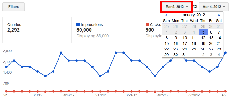
Webmaster level: All We recently updated the Top Search Queries data to take into account the average top position, we enabled programmatic download and we made sure you could still get all the queries that drive traffic to your site. Well, now it’s time to give you more search queries data!
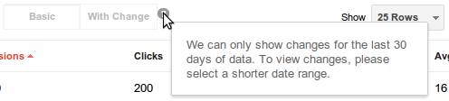
First, and most important, you can now see up to 90 days of historical data. If you click on the date picker in the top right of Search queries, you can go back three months instead of the previous 35 days.
And after you click:
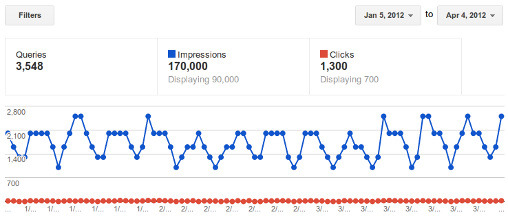
In order to see 90 days, the option to view with changes will be disabled. If you want to see the changes with respect to the previous time period, the limit remains 30 days. Changes are disabled by default but you can switch them on and off with the button between the graph and the table. Top search queries data is normally available within 2 or 3 days.
Another big improvement in Webmaster Tools is that you can now see basic search query data as soon as you verify ownership of a site. No more waiting to see your information.
Finally, we're now collecting data for the top 2000 queries for which your site gets clicks. You may see less than 2000 if we didn’t record any clicks for a particular query in a given day, or if your query data is spread out among many countries or languages. For example, a search for [flowers] on Google Canada is counted separately from a search for [flowers] on google.com. Nevertheless, with this change 98% of sites will have complete coverage. Let us know what you think. We hope the new data will be useful.
First, and most important, you can now see up to 90 days of historical data. If you click on the date picker in the top right of Search queries, you can go back three months instead of the previous 35 days.
And after you click:
In order to see 90 days, the option to view with changes will be disabled. If you want to see the changes with respect to the previous time period, the limit remains 30 days. Changes are disabled by default but you can switch them on and off with the button between the graph and the table. Top search queries data is normally available within 2 or 3 days.
Another big improvement in Webmaster Tools is that you can now see basic search query data as soon as you verify ownership of a site. No more waiting to see your information.
Finally, we're now collecting data for the top 2000 queries for which your site gets clicks. You may see less than 2000 if we didn’t record any clicks for a particular query in a given day, or if your query data is spread out among many countries or languages. For example, a search for [flowers] on Google Canada is counted separately from a search for [flowers] on google.com. Nevertheless, with this change 98% of sites will have complete coverage. Let us know what you think. We hope the new data will be useful.
Tuesday, April 24, 2012
Another step to reward high-quality sites
Webmaster level: All
Google has said before that search engine optimization, or SEO, can be positive and constructive—and we're not the only ones. Effective search engine optimization can make a site more crawlable and make individual pages more accessible and easier to find. Search engine optimization includes things as simple as keyword research to ensure that the right words are on the page, not just industry jargon that normal people will never type.
“White hat” search engine optimizers often improve the usability of a site, help create great content, or make sites faster, which is good for both users and search engines. Good search engine optimization can also mean good marketing: thinking about creative ways to make a site more compelling, which can help with search engines as well as social media. The net result of making a great site is often greater awareness of that site on the web, which can translate into more people linking to or visiting a site.
The opposite of “white hat” SEO is something called “black hat webspam” (we say “webspam” to distinguish it from email spam). In the pursuit of higher rankings or traffic, a few sites use techniques that don’t benefit users, where the intent is to look for shortcuts or loopholes that would rank pages higher than they deserve to be ranked. We see all sorts of webspam techniques every day, from keyword stuffing to link schemes that attempt to propel sites higher in rankings.
The goal of many of our ranking changes is to help searchers find sites that provide a great user experience and fulfill their information needs. We also want the “good guys” making great sites for users, not just algorithms, to see their effort rewarded. To that end we’ve launched Panda changes that successfully returned higher-quality sites in search results. And earlier this year we launched a page layout algorithm that reduces rankings for sites that don’t make much content available “above the fold.”
In the next few days, we’re launching an important algorithm change targeted at webspam. The change will decrease rankings for sites that we believe are violating Google’s existing quality guidelines. We’ve always targeted webspam in our rankings, and this algorithm represents another improvement in our efforts to reduce webspam and promote high quality content. While we can't divulge specific signals because we don't want to give people a way to game our search results and worsen the experience for users, our advice for webmasters is to focus on creating high quality sites that create a good user experience and employ white hat SEO methods instead of engaging in aggressive webspam tactics.
Here’s an example of a webspam tactic like keyword stuffing taken from a site that will be affected by this change:

Of course, most sites affected by this change aren’t so blatant. Here’s an example of a site with unusual linking patterns that is also affected by this change. Notice that if you try to read the text aloud you’ll discover that the outgoing links are completely unrelated to the actual content, and in fact the page text has been “spun” beyond recognition:

Sites affected by this change might not be easily recognizable as spamming without deep analysis or expertise, but the common thread is that these sites are doing much more than white hat SEO; we believe they are engaging in webspam tactics to manipulate search engine rankings.
The change will go live for all languages at the same time. For context, the initial Panda change affected about 12% of queries to a significant degree; this algorithm affects about 3.1% of queries in English to a degree that a regular user might notice. The change affects roughly 3% of queries in languages such as German, Chinese, and Arabic, but the impact is higher in more heavily-spammed languages. For example, 5% of Polish queries change to a degree that a regular user might notice.
We want people doing white hat search engine optimization (or even no search engine optimization at all) to be free to focus on creating amazing, compelling web sites. As always, we’ll keep our ears open for feedback on ways to iterate and improve our ranking algorithms toward that goal.
Subscribe to:
Posts (Atom)